
3 Things to do when handing a Power BI report / model for Report Personalisation
As a powerbi developer you know your data and your model inside out. Part of my role as an external consultant is to train people in using their reports and increasingly how to use the dataset in different scenarios and how to personalise the reports.
It can be difficult to enable other users to make sense of your model and to create their own reports from it easily. Yes, you can and should provide documentation which is completely essential but to be able to use the model, not necessarily the report, you need to understand the data, the relationships and the measures.
To be able to personalise the model or to create their own reports there are three things I think are easy to add-in and help with the first steps when using the dataset:
- Use the description field in the measure to write the measure expression. There is a script that you can use in Tabular Editor to enable you to do this.
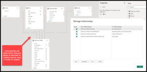
- Create an image of the data model with a view of the relationships so that other people can understand “what” filters “what”
- Create pages of tables within the report – this enables your users to understand what data is in the main tables and how the measures work.
Once the training period is over, and confidence has been built, these pages can be stored within the documentation or referred to when new users start to use the report.
What do you use as a helper for new users?